Website designers and owners are just as impatient today as they were ten years ago. They want to produce attractive websites in a matter of hours. The high expectations, stress, and shortage of time may result in subpar outcomes and disappointments, which — even worse — might lead to design mistakes.
Using ready-made templates is a time-saving solution that helps you avoid making costly design mistakes. However, how you pick and utilize a website template may result in bad outcomes as well.
The following are seven frequent mistakes to avoid when utilizing pre-built templates for your website:
1. Choosing a Template That Doesn’t Meet Your Needs
“Give me six hours to cut down a tree, and I’ll spend the first four sharpening the ax,” Abraham Lincoln is said to have stated. The significance of this phrase may be applied to website design: having the appropriate tools on hand is critical. This is especially true for templates.
A website template is the building block of any website. As a result, it must be design and functionality fit your site’s requirements. It may take time and patience to discover the pre-built template with the precise layouts, components, and compatibility you desire — as well as money in some situations. It will, however, be well worth the expense if the template meets your design and functionality needs.
Here are some things to think about as you evaluate website templates:
- What is your financial limit?
- Do you require a template or theme?
- Is the style of this template flexible at all?
- Does it represent your brand’s personality well?
- Is this design mobile-friendly?
- What is the purpose of your website, and what do you want to accomplish with it?
2. Choosing a Template with Unresponsive Elements
Since mobile devices made up about 57 percent of web page views throughout the world in August 2021, having a responsive website is no longer a nice-to-have; it’s a must.
Responsive layout is now the norm, and almost all pre-built templates and sites are marketed as such. Some of them, however, contain non-responsive components (such as text and shapes), which do not resize to accommodate the screen width. Others have fixed layouts with immovable components, such on a static navbar that will not scroll when the viewport gets narrower than the content of the page, like on a mobile device.
When previewing templates, try resizing the browser window on both your desktop and phone. If the material adjusts to fit the screen size (images, columns, and other features may get smaller or stack on top of each other), it’s likely responsive.
Here’s a preview of the Astra template, which adapts to browser window changes up to 650 pixels:
3. Using a Free Template with Branding
A free theme does not necessitate low-quality content. However, a free template is often adorned with the theme’s logo or another branding, which may make your site appear unprofessional.
Worryingly, there are some free templates that come with dangerous codes. Nulled themes, which are copies of premium WordPress Themes that have been modified and offered for free, represent a significant security risk.
Third-party maintenance services provide tools that can scan plugins and templates for any harmful code, allowing you to verify that it is safe before putting it on your website. WordPress Malware Scanner by MalCare, for example, allows you to check your site for free.
4. Ignoring User Reviews

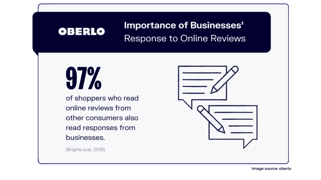
Customer reviews are common on most marketplaces that sell pre-designed templates. Before purchasing a template for your website, you’ll want to read these. If there are a lot of one-star ratings, for example, there may be serious issues or restrictions that would upset you.
Customers can rate products they’ve bought on ThemeForest, which is one of the most popular marketplaces for themes and templates. To improve your odds of finding a decent template, you may filter by star ratings and sales when looking for templates.
5. Choosing a Poorly-Coded Template
Everything from the templates themselves to their pre-built code will be created to the highest possible standards. However, this may not always be the case, especially if the marketplace or directory lacks stringent and detailed template review processes. If your template isn’t search engine optimized, for example, it might do you in long term.
We recommend that you use an eco-friendly website template to ensure that your site is lightweight and meets other coding requirements. Positive feedback is also a good indicator.
6. Not Customizing an Overused Template
Templates are similar to frameworks like Bootstrap CSS, which saves time and development resources by providing pre-designed content and components. However, because they come with pre-styled material and components, sites created using them tend to look the same out of the box. When a template or framework becomes popular, you must modify it carefully or risk looking like most websites on the internet: beautiful yet unoriginal.
For an article about Squarespace templates, for example, blogger Paige Brunton looked through roughly 100 photographer websites created on Squarespace and discovered that the Montauk template is frequently utilized – and often modified.
If you have a more intense design in mind, you may personalize the template or choose a less frequently used one that’s still responsive, well-coded, and highly rated.
7. Disregarding the Rules of Good Design
The number of low-code and no-code development platforms, as well as ready-made templates, has skyrocketed in recent years, fueled by people with little technical knowledge and even non-coders. You can now construct a website without coding, but you can’t overlook fundamental design concepts.
Templates are pre-designed, but when users modify them, the results may be dramatic. Users must tailor templates to their brand while still adhering to visual hierarchy, navigation, and consistency guidelines. It’s all about learning design principles and best practices, which may take some time. We’ll go over a few of them below.
How to Use a Website Template
1. Match your branding
You don’t want to just get creative for the sake of being different from the default template or your competition when customizing your theme. You want to express your brand identity.
Your business name, tagline, logo, and other elements of your brand should be the first thing you do. You should also replace any placeholder text with content in your company’s voice. The same goes for stock photos, icons, animations, and so on.
2. Pick a unique color scheme
One of the most crucial design decisions you’ll make is selecting your website’s color scheme. It influences your site’s accessibility, brand identity, and user experience. You should choose new colors for your website instead of relying on a template’s default palette. When carrying out any change, it’s critical to think about color theory (how colors and visuals interact with each other to create an aesthetically pleasing design) and color psychology (how colors may alter the way people see your brand psychologically).
Consideration should also be given to various colors, including blue, orange, black, and white websites.
3. Choose fonts wisely
There are several font alternatives available with website templates and themes. However, just because they offer a wide range of fonts, it does not mean you should use them all on your site. Instead, stick to 2-3 fonts and utilize a visual hierarchy based on different font sizes.
The typefaces that you select should also be legible and accessible, which means they have sufficient color contrast and are readable on a variety of devices and screen sizes.
4. Design for scannability
Even though you put a lot of effort into your content (as you should!), some people will skim it. As a result, your website must be skimmable. That will necessitate the following:
- limit the amount of text
- use negative space
- incorporate images and videos
- create a visual hierarchy
- select readable fonts
5. Be consistent
Because most templates are so simple to modify using drag-and-drop builders and other technologies, it’s easy to upgrade each page. However, as a result, the site will appear chaotic rather than distinct.
Instead, your site’s pages should all have the same background, color scheme, typeface, and even tone of writing. That does not necessitate that each page be identical. In fact, distinct sorts of sites—such as landing sites and blog entries—should use colors, fonts, and other elements in a comparable way.
6. Keep it simple
The ease of customization options that most templates give may lead you to want to include a lot of animations, pictures, movies, and other widgets. As a consequence, you might end up with an overly complicated layout that instead of informing and entertaining visitors, overloads them with information.
Instead, strive to give people with the most straightforward information and alternatives possible. Making your CTAs more apparent is a good place to start.
7. Update as needed
You don’t want to be stuck with a design that no longer meets your users’ needs and expectations as they change. Even if you select the finest template possible, adjust it to perfection, and personalize it, you’ll need to upgrade it when your visitors’ requirements and expectations change. This might necessitate the following:
- perform A/B tests
- implement strategies that work for competitors
- gather and implement feedback from your customers
- audit your site
Using Website Templates
Website templates and low- and no-code tools have revolutionized website building. People without any coding skills can now create stunning websites, but they can also make errors that jeopardize the functionality, security, and SEO of their sites. Avoiding the seven blunders and following the seven best practices outlined above will go a long way in ensuring your site is not only beautiful, but also high-performing, secure, and SEO-friendly.


