Every person requires insurance. Unfortunately, insurance agents are confronted with two significant difficulties: the product is not attractive, and the market is saturated.
So, what’s your unique selling proposition? Is it your experience and unrivaled customer service? Phew. With the insurance market being so competitive, making a strong first impression is important.
No, I’m not referring to the first impression you make when a potential client walks into your store.
The first impression potential customers get when they visit your website, especially when compared to your direct competitors, is much more important than it seems. Do you feel disappointed when you go from your site to a competitor’s and then back? Maybe you already know that your site isn’t up to par, but you don’t know how to improve it.
Why is it so crucial to have a fantastic website in the insurance sector, regardless of the situation? Because, no matter what product you’re selling (insurance, TVs, automobiles, shoes, or clothing), the Internet has revolutionized how we choose what to buy.
Any potential customer who has not come across your business through a referral, the Yellow Pages, or your most recent radio ad has discovered you via the internet. And that potential client has checked out at least ten different insurance websites, including yours and those of at least ten of your rivals.
This is especially significant in the insurance industry, where competition is fierce. Differentiating yourself on the web is a great way to gain your prospective customer’s attention and get them to engage with you.
The good news is that updating your website regularly and adhering to best practices is not difficult. These five insurance agency website design practices are critical and non-negotiable for any insurance firm looking to stay competitive in today’s digital environment:
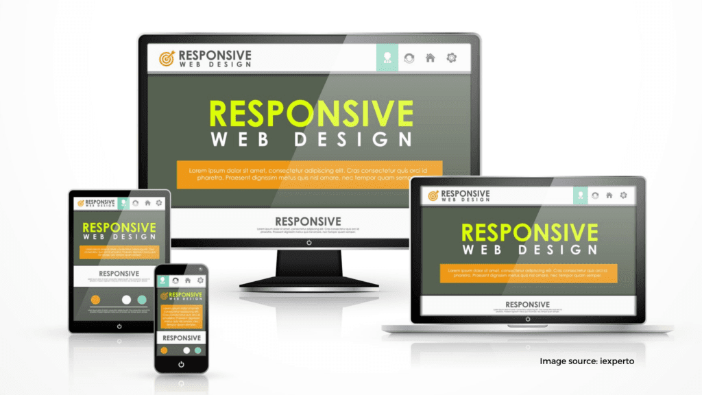
1. Responsive Design
Consumers nowadays employ their phones for everything. Smart Insights reports that mobile digital media time in the United States is now significantly higher, at 51 percent versus desktop (42 percent). What does this signify? Over half of your potential clients are using their mobile devices to learn more about your offerings. Are you giving them a good experience while browsing on a phone? Are there any other businesses in the same industry as yours?
A responsive website adapts to a broad range of devices and gives users an optimal viewing and interaction experience, including reading and navigation, across all of them. Responsive websites deliver a smooth experience regardless of the device.
Responsive websites are also more likely to rank higher in search engine results pages (SERPs). On April 21, 2015, Google published a software update that boosted the visibility of mobile-friendly sites while penalizing those that could not be viewed on mobile devices. If you’re not sure whether or not your site is mobile-friendly by Google, you can try it out.
2. Support the Buyer’s Journey
When it comes to content creation, concentrate on the things that potential customers enjoy most and produce material that emotionally connects with them. At the end of the day, potential clients are not going to be concerned about policy specifics; they will simply want to be safe.
On a business’s website, it’s all too easy to fall into the “it’s all about me” trap. You want to discuss what you do, how you can help, and why you’re qualified unthinkingly. Your website isn’t a brochure. It’s a knowledge center for your clients that they can interact with. Users should be treated as customers who come into your doors would be treated.
Consider attending a networking event. You meet someone over a drink and begin discussing. Consider this – you won’t start the conversation talking about yourself. Instead, you’ll talk about the weather and other mundane things with the client until you’ve built a rapport. Then you’ll assess the client’s demands and determine the finest available solution together.
Your website should achieve the same results.
So, how can you determine a potential client’s requirements before speaking with them? Understanding where they are on their buying journey is the first step. Every person who visits a website isn’t necessarily going to buy after the first encounter. Customers will search for and evaluate products and services. The greatest thing you can do is make things simple for them.
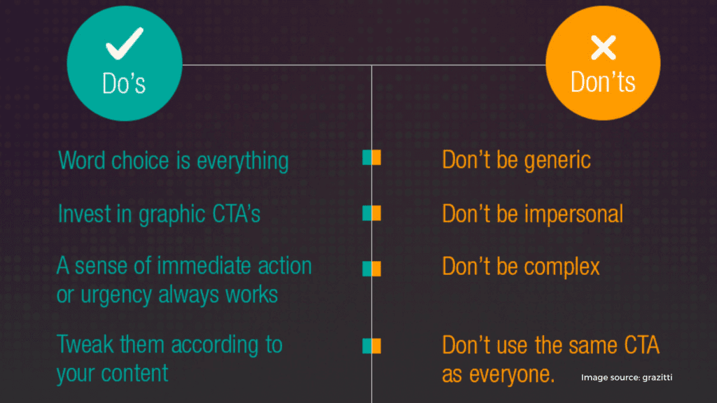
Call-to-Action Placement
A call-to-action, often known as a “CTA,” is a type of text and visual element used to pique readers’ interests and push them to take action. These are most frequently employed as “gates” for downloadable tip-sheets, eBooks, white papers, and webinar recordings. They need the user to provide a certain amount of information before they can get the file (name, email address, phone number, etc.).
Place these call-to-action buttons on your services pages to get to know your potential customer better. By including a relevant call-to-action on a service page, you can figure out whether a customer is interested in that service and how interested they are.
You can distinguish between casually seeking for a solution and having already chosen one if you know what type of content services you provide, as well as the sort of information your website visitors are expected to reveal.
Knowledge Center Resources
Your website should not be a sales pitch. People despise being pitched to, and no matter how intelligent you believe yourself to be, potential clients will notice when you are attempting to “sell” to them. It is frequently interpreted as deceptive, opportunistic, and completely ineffective.
So, be helpful! Your website may be a highly beneficial tool for educating potential clients. To allow customers to access your most valuable material in one location, a Knowledge Center should be prominently featured on your website.
Knowledge Centers are most successful when they are simple to browse, allowing users to filter by topic or content type. don’t forget to restrict access to your content until after they’ve completed a conversion form. After all, you want this information to be a source of inbound insurance leads.
3. Simple Navigation
Consider for a moment how long it takes to get a person from point A to point B on your website. Three clicks is a reasonable amount of time to move someone through your site and get them where they need to go. Any more than that, and it becomes difficult and unintuitive. A website with an unclear interface is ineffective.
You should have a clear understanding of who your potential customers are, what they want, and where their pain spots are before they even visit your website. Every time they visit your website, keep these elements in mind. These are the term used to describe personas based on an audience’s characteristics.
Easy Access to Important Documents
Your website isn’t only a means to acquire new customers. It’s also a tool for retaining clients and converting them into brand advocates down the road. Online document access, for example, and private client portals may be quite beneficial to returning consumers.
Easy Access to Contact Information
Insurance is something you have until you need it, and then you pay for and maintain it indefinitely. In most situations, it’s a fairly “set it and forget about it” product. When the necessity arises, however, it is usually due to a critical problem in your client’s life.
Make sure your contact information is readily accessible and consistently displayed on your website when the worst occurs.
On every single page, I include contact information in the lower right corner. This is in addition to a clearly defined Contact page in the main navigation, which ensures that your site’s visitors can quickly and simply discover how to contact you when they need it most.
Notify your visitors to check in regularly so that they know how you can reach them, and make sure your contact information is clearly visible on your website. Make sure you visit on a regular basis to verify the data you’ve supplied is correct and up to date.
Finally, don’t forget about your mobile users. Number one in the best practice series (see above) is to have a responsive website, since – as we all know – half of internet users use their smartphone to access the web. Make certain that you can click through to your contact information on a smartphone. Users should be able to pull your email address and dial your phone number with a touch of a finger.
Easy Access to Employee Information
To make it easy for visitors to learn more about your company, including a “Meet the Team” or an “About Us” page for key personnel on your website. Typically, anybody who regularly interacts with clients should have a professional headshot, career highlights and designations, and their direct contact information and links to professional social networks like LinkedIn. This is a critical aspect of humanizing your brand.
If a client contacts you to claim the result of a vehicle accident, a calamity like a fire or the death in their family, they want to know that someone will be sympathetic on the other end. They don’t want to talk to someone in a different country. Instead, they want to connect with someone who understands and knows what they need – someone they have previously met.
Make this connection simple. Adding real photos of your actual staff to your website will instantly make potential and current clients more justified in their choice to work with you. Your website will stand out from the crowd when it uses professional-quality images that are high in contrast and color. It will also contrast with the numerous insurance firms that utilize stock photos from a bygone era.
4. Be on Trend
In terms of web design, a trend is an ongoing development or change in direction. Trends aren’t revolutionary; rather, they are evolutionary. Over time, they influence our perception of what websites are supposed to look like and mold our opinions on the matter. Consider it for a moment. Now, big 80s hair looks odd, but it was not at all unusual in the 1980s.
Unfortunately, many insurance agency websites are the internet equivalent of big 1980s hair. Your potential clients are experienced internet users and browsing site after the site isn’t anything new to them. Your site shouldn’t be a huge departure from how it has previously appeared if you’ve used numerous different sites and have accepted the “correct” appearance of a website.
Your website should be following the most current web trends and providing your potential consumers with a user experience that matches their expectations.
White Space
The concept of “above the fold” is no longer relevant, so don’t build a site with all elements crammed into a tiny space. Let your visitors wander around and allow your page components to breathe. Whitespace has five advantages:
- Whitespace Aids in the Use of Design. Carefully placed whitespace may aid in the navigation of your site, aiding in the discovery of what visitors are searching for, and making certain interactions stand out.
- Whitespace improves readability. It’s unlikely that a potential customer would thoroughly read every last word of your text on your website. Using whitespace correctly can help readers skim through your material and make big bodies of writing appear more approachable.
- White space provides a break for users. Remove the clutter and assist your user in focusing on what is most essential. Allow the user to make as few decisions as possible. Whitespace may even suggest a particular aim of yours if utilized correctly.
- Whitespace Is Modern and Appealing. Increased usage of whitespace is not only beneficial to your users, but it also looks fantastic. Minimalism in design appears professional and may assist in the highlighting of a single product.
Flat Design
Flat design is a web fad that demonstrates how to maintain an on-trend website. Designers have been moving towards this minimalist style, which puts a focus on user experience, for the past several years. Flat design eliminates all of the distractions that come with typical web design frills and – when done correctly – focuses the user on the material and actions you want them to take.
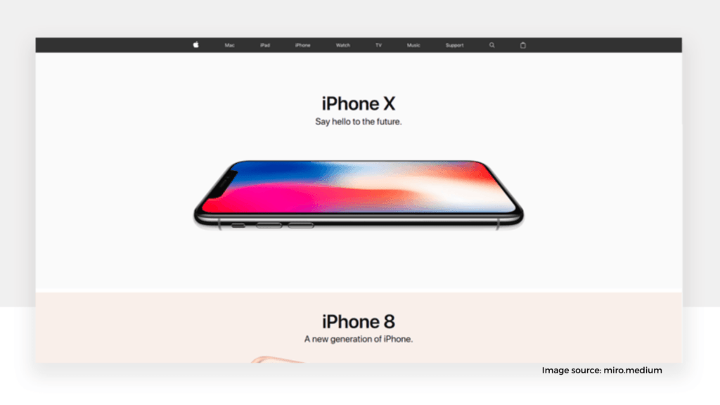
Large Images
Make your content appealing. Insurance isn’t attractive, but the things it protects are. Using grandiose, beautiful, and genuine pictures may elicit an emotional response in potential clients. To make prominent content stand out and convert, combine big photos with a strong tagline and call-to-action button.
The ideal picture may be professional, formal, and stylish.
5. Blog
There are no longer any excuses if you do not already have a company blog. Blogs are powerful tools for increasing site traffic, converting leads, establishing industry thought leadership and boosting brand awareness. Yes, all of this may be accomplished from one website feature.
Client Education
Your website should not be a marketing tool. The objective should always be to assist potential clients in locating a solution to a problem. Above all, the main purpose of a blog is to educate and answer queries.
A good blog not only informs potential clients about your offerings, but also allows people to learn more about you. For those potential client researchers that will skip the first phone conversation with your agency, this is an excellent approach to show personality and develop a personal connection that connects with leads to long-term client relationships.
SEO
Blogs are an excellent way to boost your SEO (search engine optimization). What’s the rationale? You’re adding a new page to your website with each new blog post you publish. Small businesses benefit greatly from this because it gives Google the impression that your site is just as good, if not better than a bigger competitor.
While these are excellent beginnings, they cannot be relied on as a complete marketing strategy. Creating relevant blog material with keywords that are relevant to your industry or topic will provide you with an edge. Rather than putting all of these keywords on a single services page, you may write blog articles that solely address a certain issue.
To Summarize
Some of the suggestions we’ve mentioned today are quite self-evident. Your insurance website design is either responsive or not; you have a blog or not. Others, on the other hand, may need some additional research to fully evaluate.
Recognizing your consumers and the journey they will take through your site before they make a buying decision is critical. This will assist you in getting to know prospective clients better and how to market to them. Consider polling your prospective customers next time you’re on a client call if you want an immediate answer.
Let’s look at how advertising changes the behavior of customers. When was the last time you looked on social media and saw an ad for your business? How long will it take them to find what they’re looking for if they don’t know where to begin?
Remember that potential clients will conduct a lot of research before contacting you. Make sure you’re meeting their expectations. Create a blog and a knowledge center on your website. It also aids in the understanding of a potential customer’s needs by the content they consume and download. This gives your sales staff the edge they need to pounce on a hot lead and provide a solution. Make sure your insurance agency website is working hard for you. It’s your finest salesperson, so make sure it’s in tip-top shape.