Veterinary marketing has come a long way in recent years. The days of blindly putting up a website and hoping clients will find you are gone. In today’s market, vets must be proactive in their marketing efforts and create a website that is not only informative, but appealing to potential clients. Web pages that are easy to navigate, visually appealing, and provide relevant information are more likely to be successful in attracting new clients.
What does your veterinarian’s website design tell others about the practice? Your online presence is essentially a virtual manifestation of your company, and it’s often a client’s first impression of you. In fact, poor web design may lead users to leave or distrust a site. Social media marketing company, Hootsuite, found that 38% of consumers will stop engaging with a website if the content/layout is unattractive.
First impressions matter, and in the world of web design, first impressions are made within 50 milliseconds. That’s right—within one-twentieth of a second, a viewer has already subconsciously decided whether they like your website or not.
As part of your digital marketing strategy, don’t accept a bland website that may lose you customers and patients. It’s time to invite pet owners to your digital practice and convert them into appointments. Use these ideas to help you develop a more engaging veterinary website.
Make Your Website Mobile Responsive
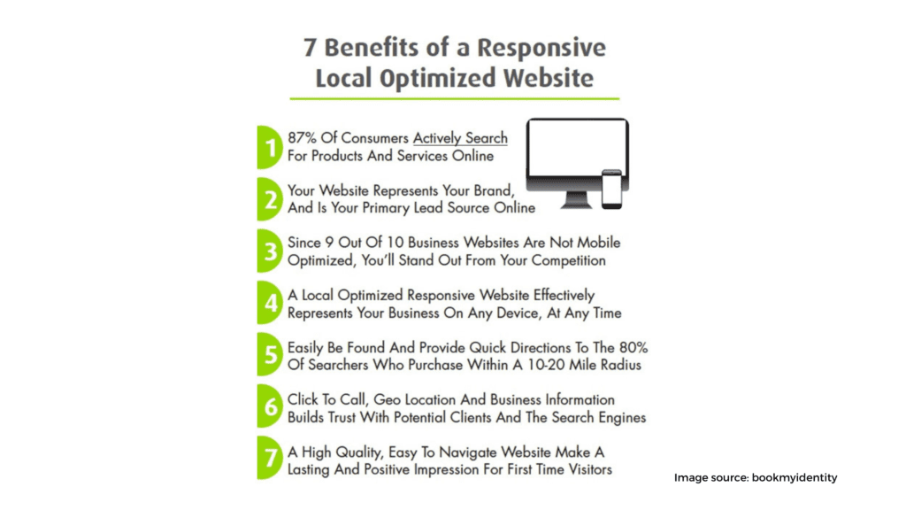
Can you remember when you had to pinch and zoom in to see anything on a shrunken version of a desktop site on your mobile device? It wasn’t the most convenient experience. Now we can easily read text without zooming in, and no horizontal scrolling. A responsive layout guarantees that any user on any device will have the best experience possible on your veterinary website. Mobile marketing is crucial to reach new clients, as over 60% of users will leave a site that isn’t mobile-friendly.
Google penalizes sites that aren’t mobile responsive, so not only will you lose out on potential business, but your ranking in search results will suffer as well. A separate mobile site is no longer an option—it’s a necessity.
If your site isn’t optimized for these smaller screens, you might see a drop in search engine rankings. This means pet owners searching for veterinary services like pet dental, vaccinations, wellness exams, pet surgery, and grooming may not be able to find your practice online. This is not only disliked by users, but search engines as well.
Website responsiveness is another great way to refine your site’s content, this ensures those using a mobile device are seeing only the most important elements. It will boost your search rankings, too. The most recent Google algorithm update makes responsive web design more visible on search engine results, favoring more mobile-friendly websites.
Integrate Search Engine Optimization (SEO)
As far as email marketing or other digital marketing channels are concerned, driving traffic to your website is only half the battle. Once pet owners are on your site, you need to make sure they stay there long enough to become converted leads. That’s where SEO comes in.
Part of having an effective website is mak ing sure it’s visible in search engine results. Search Engine Optimization (SEO) should be a key component of your website design and development from the beginning. By incorporating specific keyword phrases related to your veterinary services, you can help connect searchers to your site and improve your ranking in search results.
Some design ideas to consider for better SEO include:
- Creating unique title tags for each page
- Using heading tags throughout the site’s content
- Incorporating keywords into page content
- Adding alt tags to images
SEO takes time to show results, but it’s worth the investment. Once you’ve implemented these changes, monitor your traffic and rankings using Google Analytics or another web analytics tool. These programs can help you track your progress and adjust your SEO strategy as needed. Include Google ads as part of your digital marketing strategy to help increase traffic to your website while you wait for your SEO efforts to take off.
Design for User Experience

Your website’s design should focus on delivering a great experience to visitors. Every element on the page, from the colors and fonts to the layout and images, should be carefully chosen to create a cohesive look that reflects your brand. The overall goal is to make it easy for users to find the information they need and take the actions you want them to take, whether that’s scheduling an appointment or subscribing to your newsletter.
Some user experience (UX) design ideas to keep in mind include:
- Creating a clear hierarchy of information with headlines and subheadings
- Using short paragraphs and bullet points to make content easy to scan
- Adding calls to action (CTAs) throughout the site
- Incorporating images and videos to break up text and add visual interest
- Creating a simple, intuitive navigation system
Think about your website from the perspective of a first-time visitor. Is it easy to find what they’re looking for? Are the pages well organized? Is the content engaging and informative? If not, make some changes to improve the UX.
Add Educational Content & Graphics That Appeal to Pet Owners
Now that your customers can access your veterinary website from anywhere, it’s time to keep them coming back. You’ll need high-resolution, visually appealing veterinary images with useful information. Ensure that your material meets these criteria:
- Answers to the most frequently asked queries about pets, such as how to clean my pet’s teeth at home, which activities are best for my dog, how to bathe my cat, and so on.
- Educates current and potential new clients about the services you provide and specialize in, such as spay and neuter, heartworm prevention, puppy vaccinations, cat vaccines, flea and tick treatment, microchipping, dermatology procedures.
- It resonates with pet owners. Use eye-catching photos that are in line with your brand and entice pet owners. According to studies, people recall 80% of what they see and 20% of what they read. Make sure your images are veterinary acceptable and reflect the services you provide.
Have an Easy-to-Use Navigation Menu

With all these elements in place, you’ll want to make sure it’s easily accessible. Create a simple and well-organized navigation menu. First, define the different sections of your veterinary website — imagine them as the signs above each aisle in a pet store. Here is an example of a veterinary navigation bar:
- Services 2. Online Store 3. Patient Center 4. About Us 5. Resources 6. More
Under each tab add short and concise descriptions. Here’s an example, for services add, bloodwork, dog training, microchipping, preventive care, radiology, and more. Under patient center, you can add your online forms, what to expect, payment options, and a pet wellness program if you have one. You want to make your veterinary website navigation as seamless, stress-free, and intuitive as possible.
Make Compelling Veterinary Videos

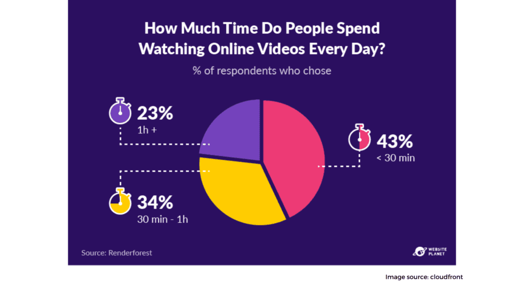
Content marketing campaigns are an important part of any marketing strategy and should be included in your veterinary website design. Videos and images keep people’s attention than text alone, with landing pages that include videos increasing conversions by over 80%. Video marketing for veterinarians is critical to attracting new clients and offering them an appreciation of the work you do in your practice.
Videos may be published on your veterinary practice’s website under the blog section, landing pages, newsletters, social media channels, and emails. This will assist to raise awareness and increase interaction. Check out these video suggestions for Veterinary Practices that you can include to your website to get you started:
- What to Expect: Meet our Veterinary Team (give a practice tour)
- How to Train a Shelter or Rescue Dog
- Short Tutorials on Teeth Brushing
- Tips for New Pet Parents
- How to Properly Bathe My Dog at Home
- Puppy Vaccines When to Get Them & Why
Use Clear Calls to Action on Your Website
What do you want your website visitors to do when they visit your page? Make a reservation? Purchase a pet product? Join your email newsletter? It’s critical to consider your call to actions. A call to action (CTA) may quickly urge visitors on your veterinary website to take action, and it’s an important design element. Determine what you want to achieve before writing any call to action.
Make sure your buttons have simple, straightforward text on them such as “unlock offer,” “learn more,” or “click here.” If you use buttons in your design, make sure they are noticeable. Here are some CTAs and unique offers you might use on your website:
- $15 Discount on Any Service – Claim Offer
- New Client Special – $35 Off – Redeem Offer
- Rescues Only, Free First Exams – Click Here
- Spay and Neuter Specials- Learn More
- Join Our Veterinary Community- Sign Up or Subscribe Now
- 50% Off Microchip Implantation – Microchip My Pet
- Call Us Today!
- Request an Appointment
The clearest and most precise call to actions are the most effective. They create a sense of urgency that pushes consumers to act. Do not make your visitors confused with too many call to actions. A pop-up banner message on your website can also be used to notify people about any pressing issues related to your clinic, as well as any changes, special offers, or discounts.
Conclusion
A well-designed website will set your veterinary practice apart from the rest. By including these steps and tips in your digital marketing campaigns, you can create a veterinary website design that is not only visually appealing but also easy to navigate, informative, and engaging. Creating compelling content, adding videos, and using clear calls to actions will also help convert visitors into clients.
For more information on how to create a veterinary website design that works for you and your clients, contact a professional veterinary marketing company.


